

VIVIANO FAMILY
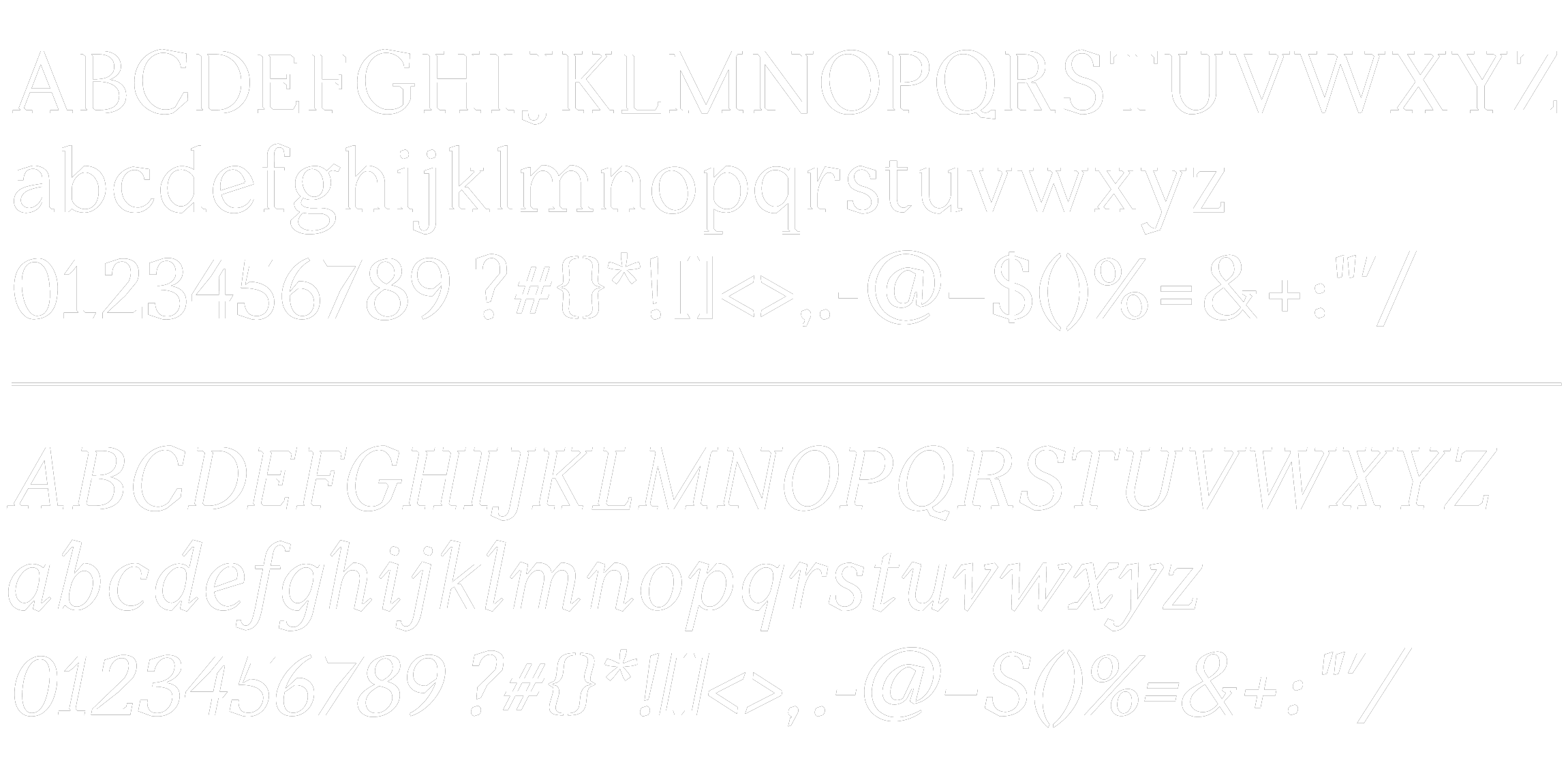
Viviano is a typeface designed to work well at a text weight, but still possess unique details that provide intrigue at a larger scale. To achieve this, typefaces with serifs that had unconventional features, like Lora, Noam, and GT Sectra were sourced as inspiration. It became clear that the idea of a half-slab, half-traditional serif would become a key feature of the font, with an additional inktrap component in the form. Another key feature of the characters is an angular cut across the top of the rounded letters. This element is applied consistently to the alphabet, and follows the expansion model more traditionally than the font's expressive serifs. Viviano Book at text weight includes inktrap or ‘notched’ half-serifs, with a high-contrast angular component to the rounded letters., which will eventually be translated into the coming bold and italic weights.