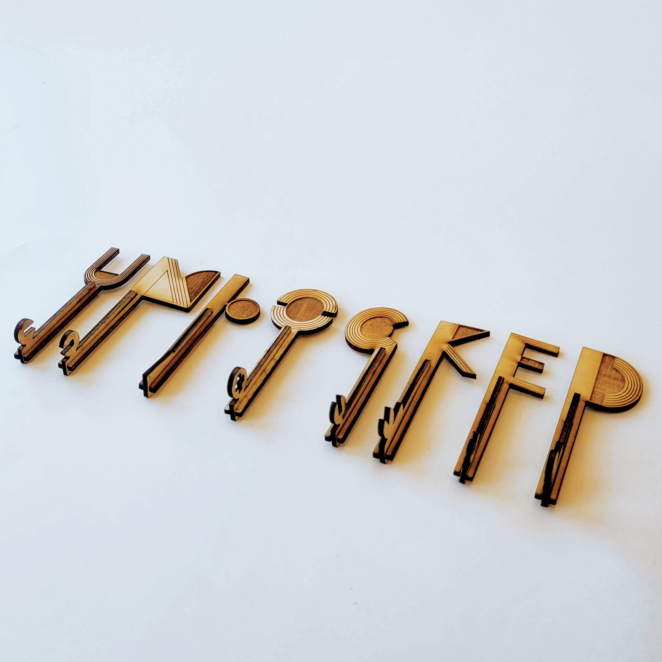
UNLOCKED
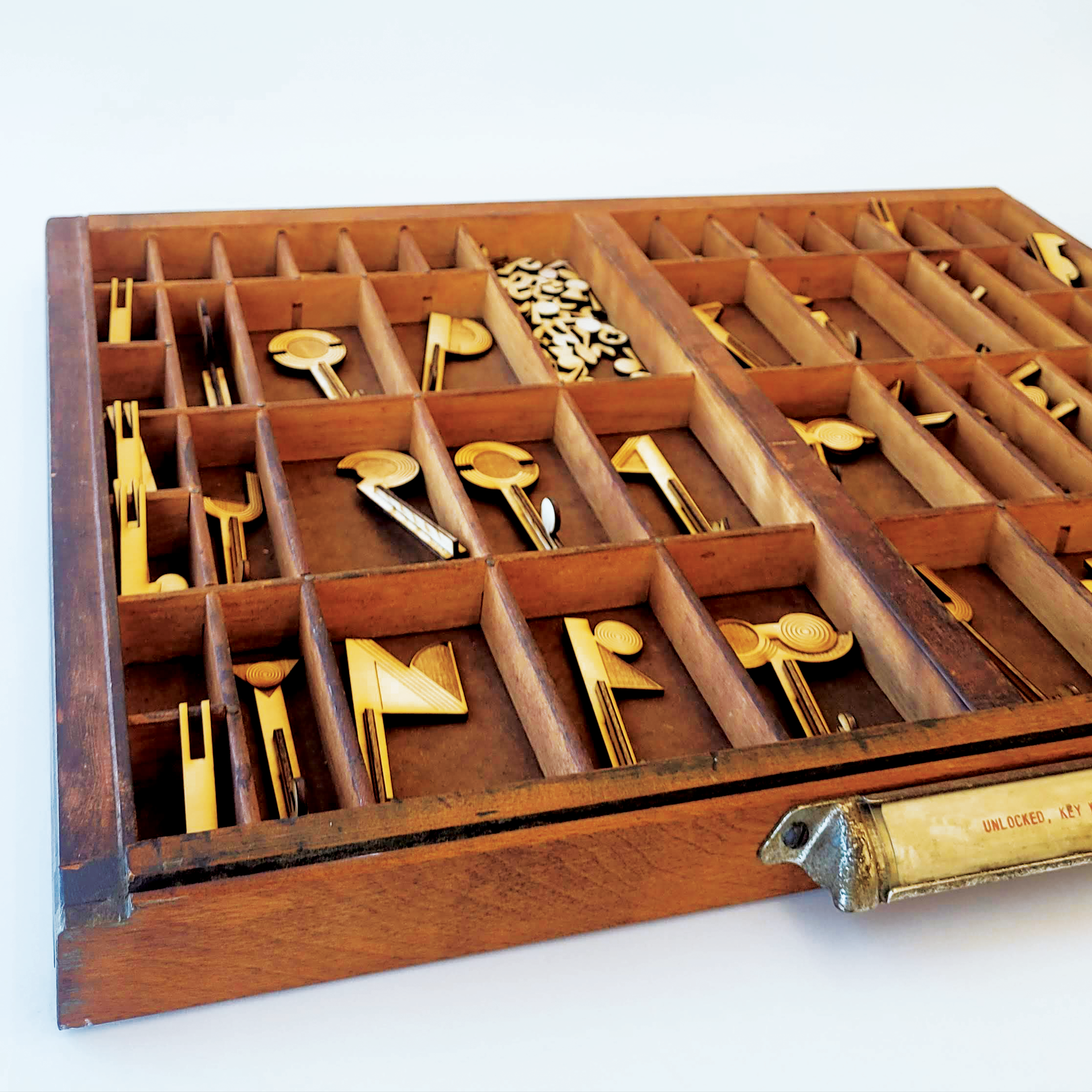
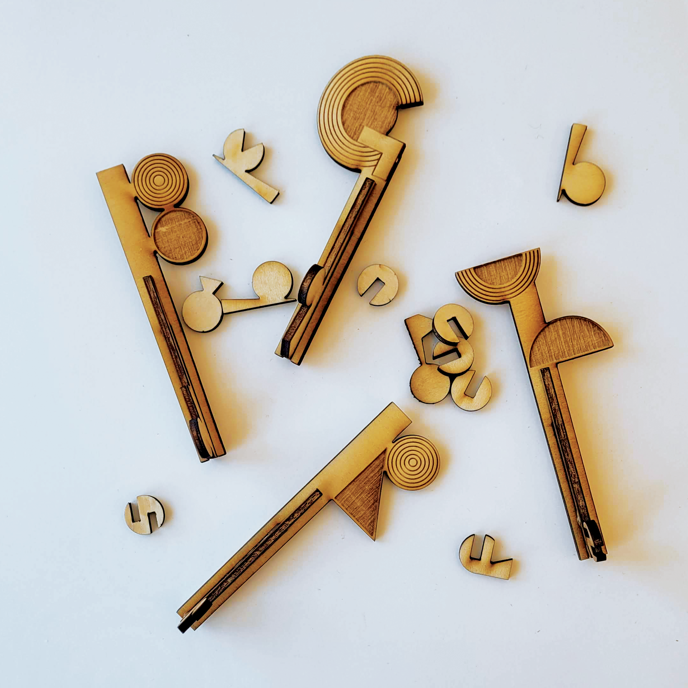
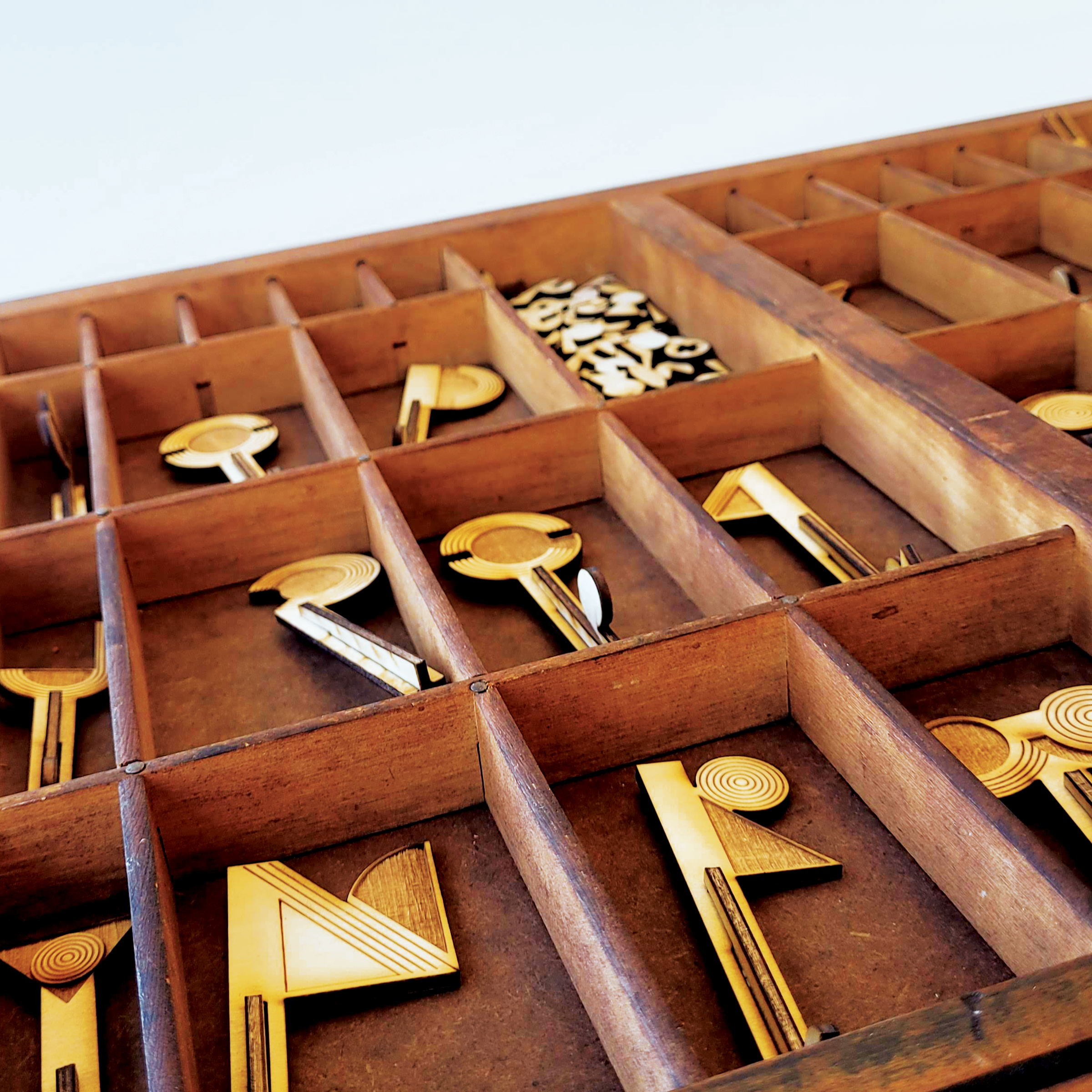
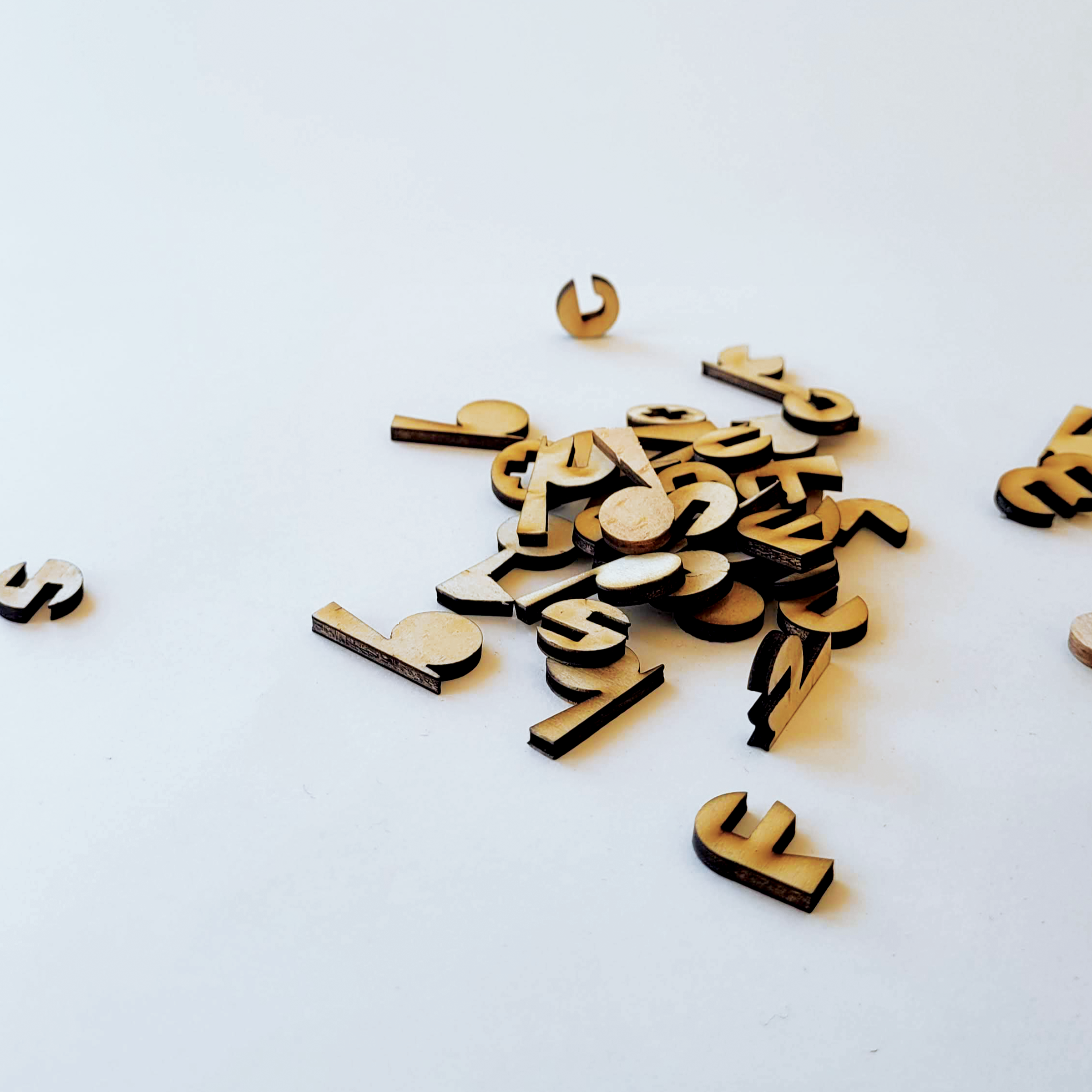
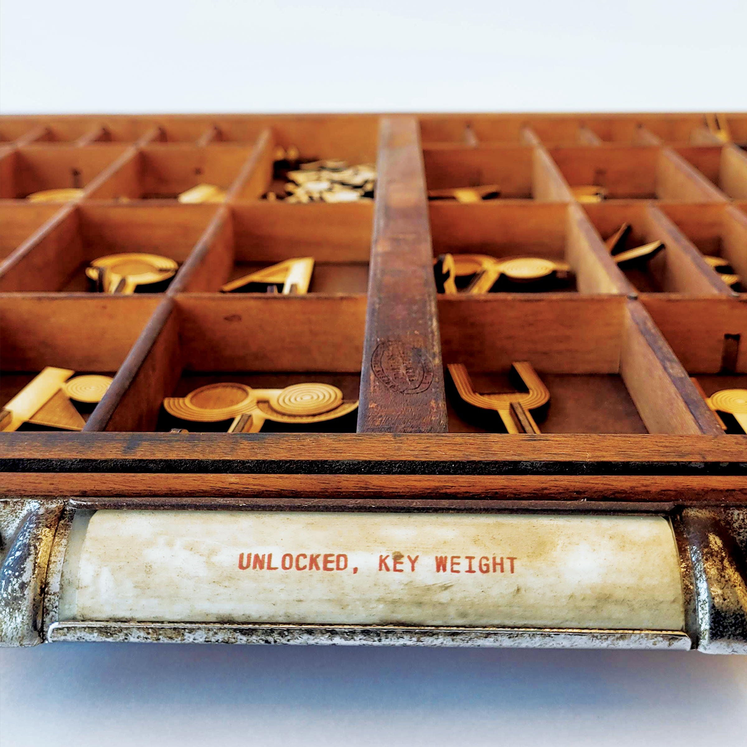
This project began as a poster, showcasing an early, digital version of Unlocked typeface. I’ve always had a fascination for skeleton keys and the history that comes with them, so for this typeface I decided to draw upon key and keyhole shapes that naturally lend themselves towards letterform shapes (take the lowercase 'i' for example, which comes directly from the classic keyhole shape). Even in this early design, the teeth of each upper case key corresponded to its lowercase counterpart, creating a theoretically functional design where the uppercase keys would fit into the lowercase keyholes.
Since this first iteration, I have been wanting to develop the system three dimensionally. Drawing a correlation between my project and the idea of liminality sparked a line of inquiry that led me to the key designs; keys and keyholes being a literal symbol for in-between spaces, but letters also representing the liminal space between ideas and words.
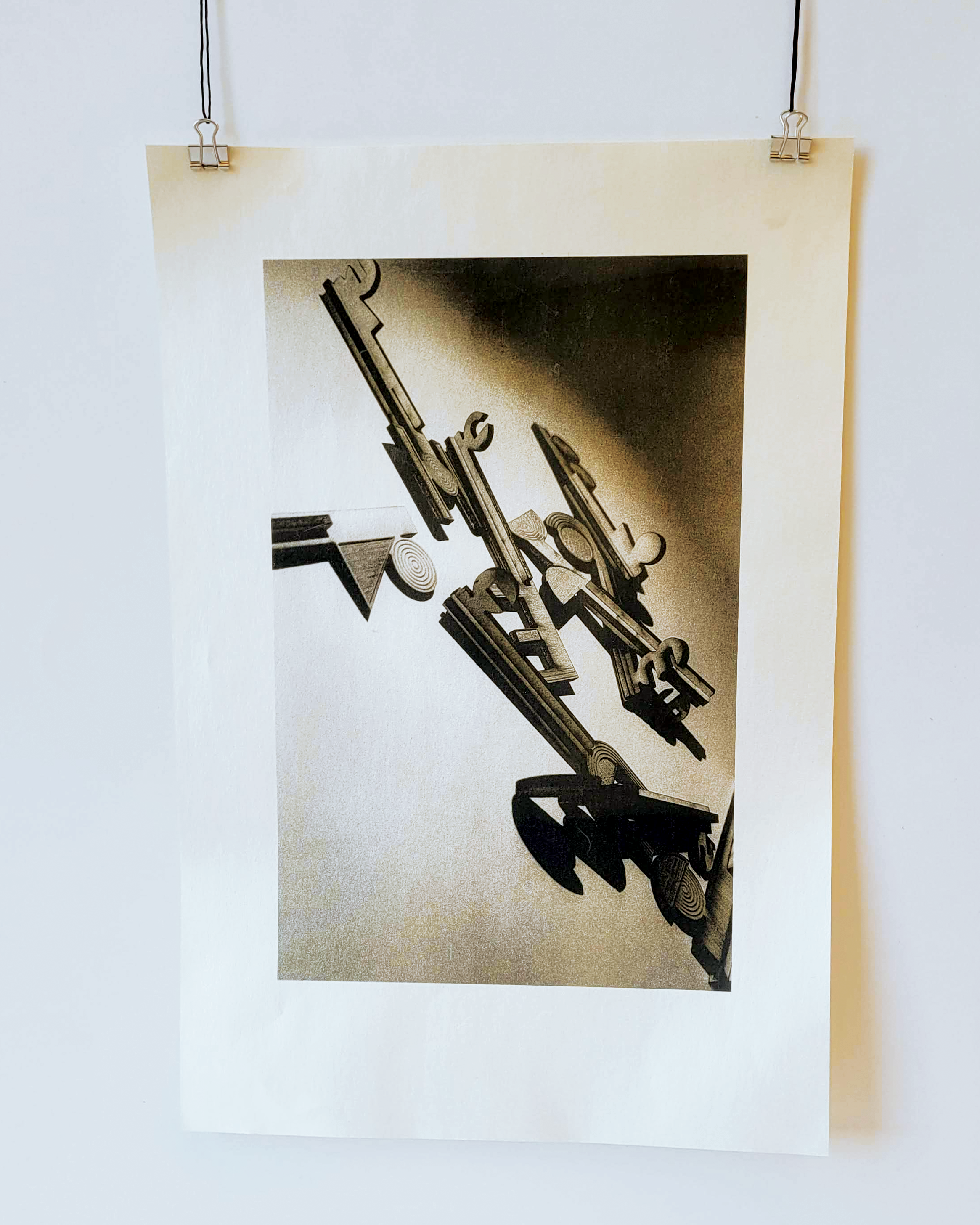
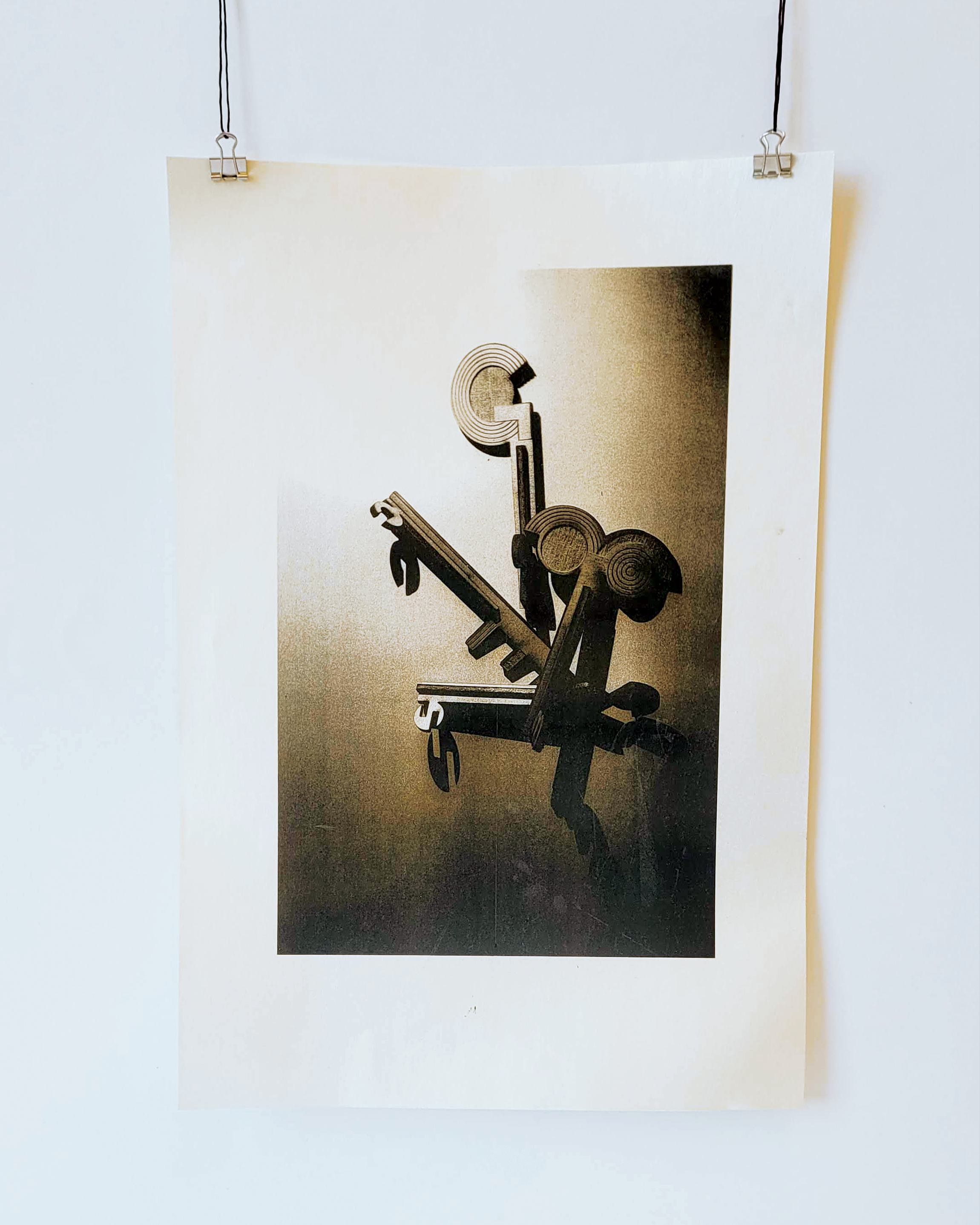
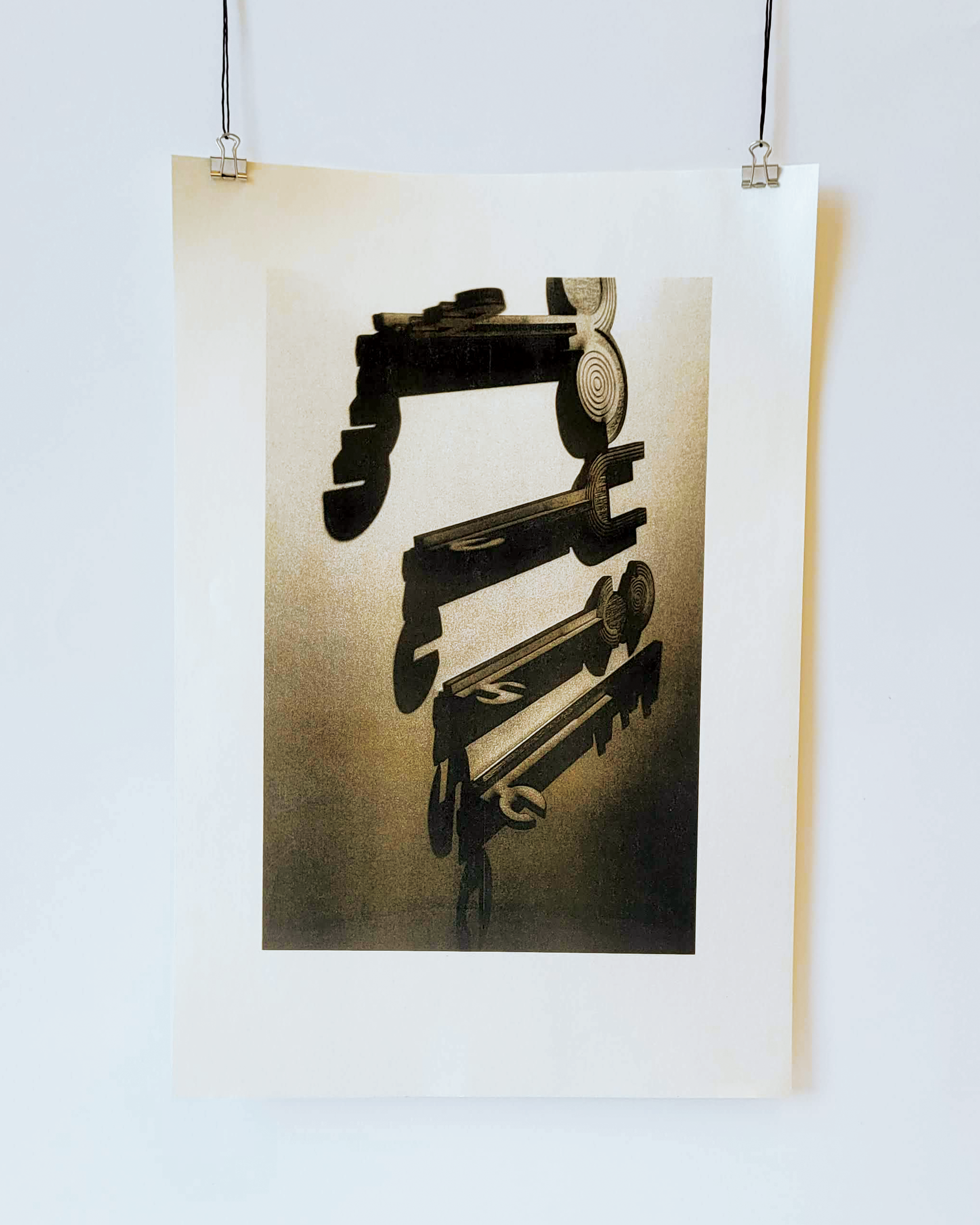
I opted to engrave my design and laser-cut wood panels to create both uppercase and lowercase sets. Once printed and cut, the keys were housed in a metal type case drawer, as well as photographed to be printed using a risograph. The photography was done under high-contrast lighting to offset the lowercase shadows cast from the uppercase wooden forms.